When I visited Norway for the first time, my biggest challenge was driving on the right-hand side of the road. Every turn, every signal, every instinct felt off.
I wasn’t exactly lost. But it took way more effort than cruising through the left-side driving lanes in India.
That’s exactly how people feel when they try to navigate your website or app in a language they don’t speak fluently. Sure, they can use it. But it feels clunky, disorienting, and far from intuitive.
This friction is the fastest way to lose a user’s attention and trust.
That’s why you need to invest in UI localization and make your software feel familiar and functional.
In this guide, we’ll break down seven best practices to get started with UI localization with some real-world examples to inspire you.
UI localization is the process of recreating your website or software’s user interface in line with a target market’s linguistic needs, cultural nuances, and regulations. This part of your localization strategy specifically focuses on design elements like layouts, colors, button placements, and more to create a more user-friendly experience.
Why localize your website and app’s UI
🔔 Story time
I once downloaded a calorie counter app only to be left surprised. Everything was written in a language I didn’t understand (or recognize), the design was all over the place, and nothing made sense.
I closed the app and uninstalled it, stat.
That’s the main argument for UI localization. Localizing your site or app’s interface creates an experience that feels native, intuitive, and built for your users.
With UI localization, you can:
Offer ease of use
Using an app in a different language takes up a lot of mental bandwidth.
Even users who are fluent in English—whether they speak Spanish, Hindi, or Greek at home—have to spend extra effort navigating an app that isn’t in their native language.
Localizing your app removes that friction. It gives users a sense of ease and familiarity right from the first tap.
Engage users with clarity
First-time users of your app or website already feel a bit lost.
If they can’t understand what’s on the screen or have to mentally convert currencies just to make a decision, they’re more likely to give up than stick around.
Localization replaces this confusion with clarity. When your app speaks people’s language and reflects their local context, everything makes sense. That means they’re far more likely to engage, explore, and come back for more.
Gain trust and confidence
When users see their own language, dates/currencies, and cultural cues, it signals that your product was made with them in mind.
UI localization shows users you’ve done your homework. It indicates that you:
Care enough to speak their language
Respect their culture and norms
Meet them where they are
That kind of effort earns trust.
👀Need tips for localizing your software?
Check out our comprehensive guide on software localization with best practices, case studies, and tools to help you adapt your product for every market.
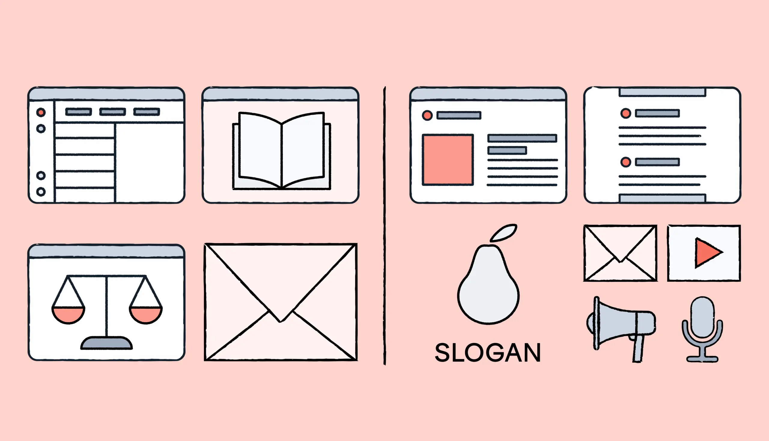
7 best practices to get started with UI localization
Here’s how to plan for and win at UI localization.
1. Prepare the groundwork for localized design
Instead of getting started with translations right away, take a step back to make your product localization-ready in the long run. You’re essentially building the foundation to make UI localization easy and scalable.
Start by identifying every bit of user-facing text that you have to localize. Think error messages, tooltips, CTA buttons, confirmation popups, and more.
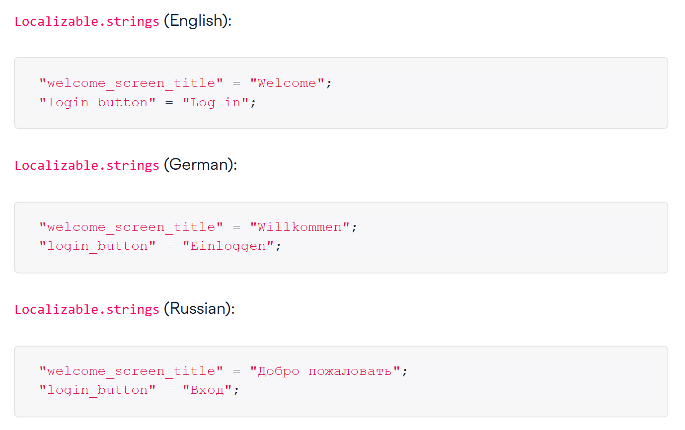
Next, move these bits of text into resource files (also called strings) so they can be translated later.
And here’s the important part: add context for each string. For example, tell your translators if a phrase sits on a tiny button or needs to match a character limit. More context = Fewer mistakes and rewrites.
Once the text part is sorted, shift your focus to the visual side of UI localization.
Your interface should be flexible enough to support languages that take up more space (like German or Finnish). A tiny English word like “Edit” might stretch into 15+ characters elsewhere. So, make sure your pop-ups and modals have room for multi-line translations instead of cutting off.
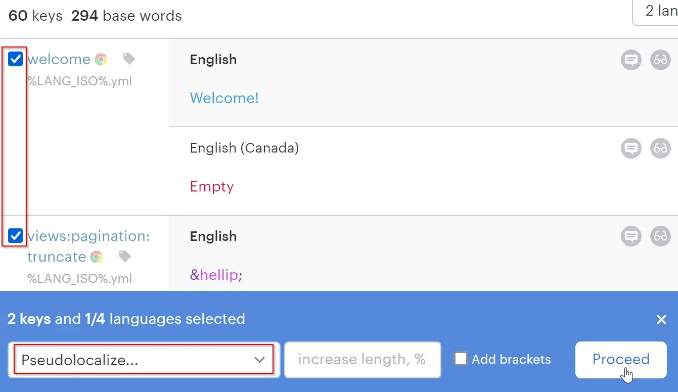
💡Pro tip
Run a pseudo-localization test with Lokalise. Replace your app’s text with longer, accented characters and add some extra spacing. If your layout breaks, clips, or overflows, you’ll know where you still need to make room.
This is also a good time to identify UI design elements that will definitely change per locale, such as:
Reading order
Currencies and units
Dates, times, and numeric formats
Colors or symbols for cultural relevance
It doesn’t mean you need to localize them right away, but it helps to know what might need adjusting later.
2. Translate with cultural relevance
Translation is a critical piece of the UI localization puzzle. Give translators the resources and guidance to make your app feel native to the target users. Here’s how:
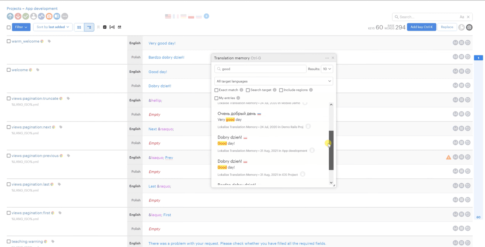
Show the full picture: Capture screenshots showing where each piece of text appears in your site/app. Add notes or examples explaining how each string is used. This essential context leads to better, more accurate translations.
Create detailed briefs: Offer a detailed brief with guidelines about tone of voice, reading level, brand terminology, and cultural sensitivities. This brief will offer clarity and create guardrails to avoid any mistakes in the translated content.
When localizing your app UI, you can also lean on transcreation. It’s a more creative way of translating content to create the same impact and emotional appeal as the original version.
So, if you’re rolling out a holiday sale banner or launching a new feature with an in-app banner, use transcreation to create some buzz. Here’s an example:
Swipe for savings (English): A playful phrase suggesting both swiping through an app and discovering discounts
Deslize e economize (Portuguese): Uses rhyme and a casual tone to keep the swiping metaphor while matching the rhythm and mood
쓱쓱 넘기면 할인 팡팡! (Korean): A lively phrase that mimics the energetic style often used in Korean promotional language
🔥 Your marketing content needs transcreation
We chatted with Acclaro’s translation director to learn how global brands can win at the local level with marketing campaigns. Her advice? Use transcreation. Find out more about the role of transcreation in marketing and the impact it can create.
3. Design modular UI components
UI localization affects more than just text width. It also shapes your design’s direction, hierarchy, and symbolism. So once you’ve done the legwork to create strings and translate text, shift your focus to the design system.
An effective strategy for localizing your UI is to design modular, reusable components that automatically adapt to different languages.
Instead of hardcoding layouts or text into fixed templates, create design blocks (like cards, banners, or nav menus) that can adjust dynamically.
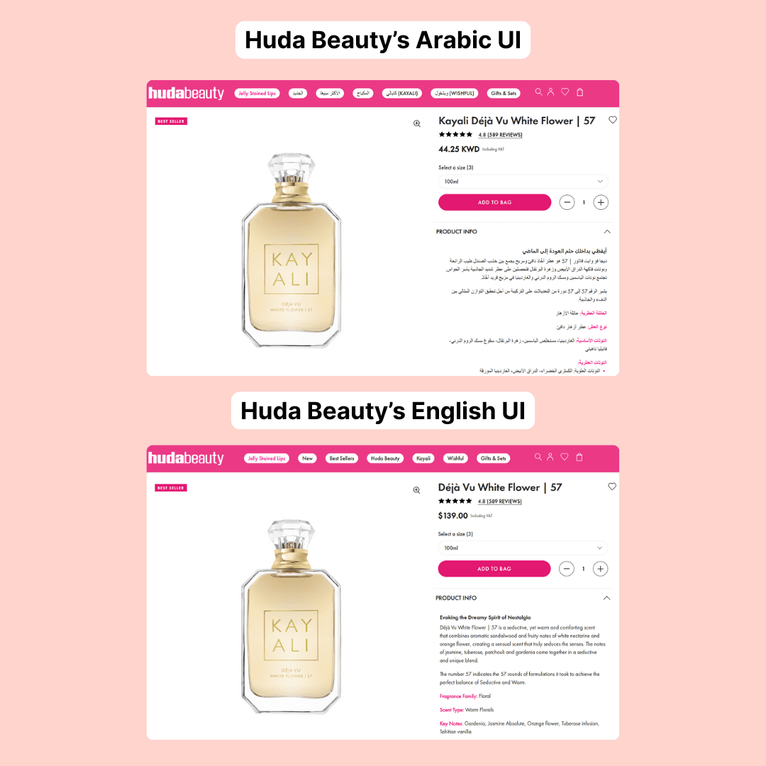
Start by creating bi-directional layouts to accommodate both left-to-right (LTR) and right-to-left (RTL) languages. This would include mirroring icons, paddings, and other elements.
Check out this example by Huda Beauty. The beauty brand uses a bi-directional layout that seamlessly translates the English copy into Arabic without breaking any design elements or consistency.
Next, you want to evaluate the ideal typography for your target languages.
Different languages require different visual styles, like:
East‑Asian scripts need larger line heights
Arabic needs stylistically appropriate Naskh font families
Some languages need larger minimum font sizes for legibility
So, pick the right fonts based on the languages you want to target. Here are a few custom fonts created for specific languages that use symbols outside the English script:
Put simply, a modular approach lets you:
Swap or restyle components per locale without redesigning entire screens
Apply overall layout rules (like RTL mirroring) at the component level
Reuse components across regions with minimal overhead
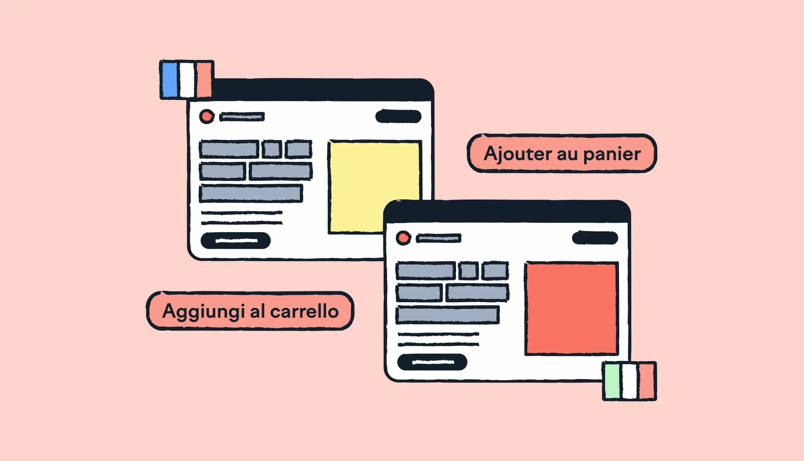
4. Localize imagery, iconography, and colors
Text is only one part of your interface. Icons, symbols, photos, and micro-interaction cues (like a thumbs-up) vary for different cultures.
Imagery is one of the key changes to make your interface feel familiar. Swap any images that don’t reflect a region’s cultural and social context. This mainly applies to websites targeting different markets. If you have such a site, plan to change the images across the board.
Another crucial factor to consider is your UI’s iconography and color palette. Gestures in icons and colors can convey a negative message. So, customize these elements for every market you’re targeting.
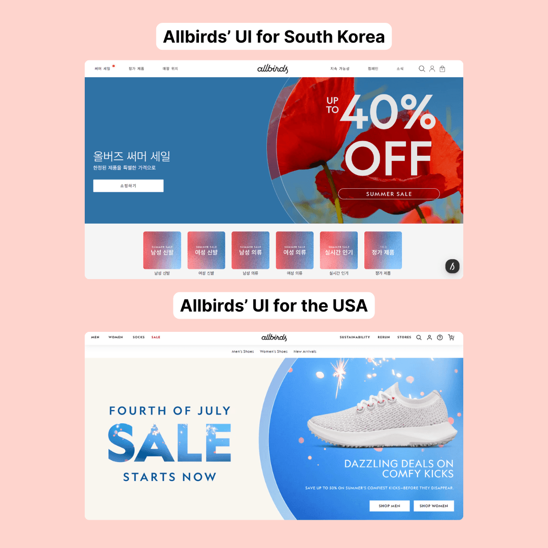
Allbirds’ localized website UI presents a great example here.
The footwear brand uses the same images of its shoes, but with different visuals. In these two versions, you’ll notice variations in color and icons. Both interfaces are designed to resonate more with the local audiences.
5. Use design tools for a localization-ready UI
As we’ve established so far, UI localization is deeply rooted in design. With the right tools, you can build interfaces that scale across languages without breaking.
For starters, use tools like Figma, Sketch, or Adobe XD to create responsive layouts. That means set up your buttons, containers, and navbars to easily expand or contract based on text length. This auto layout will prevent any overflow when strings become longer.
You can also make tones for different UI properties like:
Text alignment (text-align-ltr, text-align-rtl)
Spacing (padding-start, padding-end)
Icon placement (icon-leading, icon-trailing)
This makes your UI easily adaptable for different languages. Plus, your designers and developers can apply them consistently every time.
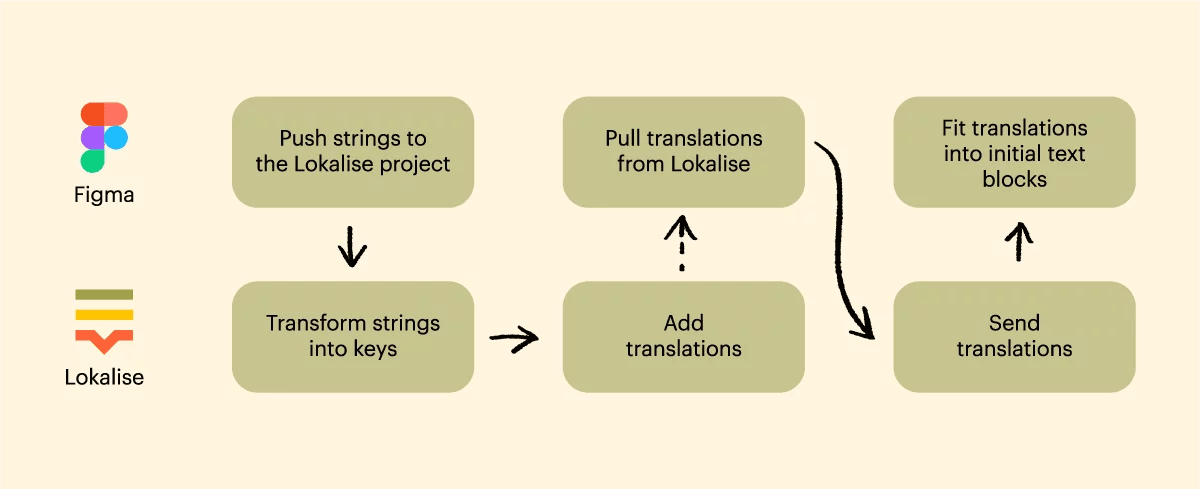
The best part? With a tool like Lokalise, it’s easy to build this design-stage localization setup. Lokalise integrates with design tools like Figma, Sketch, and Adobe XD. This creates better coordination between designers, translators, and developers to fast-track your localization workflow and preserve context without back-and-forth.
Here’s an overview of how Lokalise supports your design process:
6. Test your localized UI in action
Would you go to the office on a big presentation day without checking your outfit in the mirror? Me neither.
And that’s why you should test your localized user interface before rolling it out to your users.
Testing UI localization starts with linguistic quality assurance (LQA). Native speakers test your app to evaluate tone, fluency, and key functionality. Give them different devices and scenarios to test your app on various screen sizes, operating systems, and network conditions.
You can also work with beta testers to assess an early version of your product. These real users can catch any cultural errors and pinpoint anything they find confusing. This hands-on feedback will go a long way in improving your localized version.
Use this checklist for testing your UI:
Ensure all labels, buttons, and menus adapt to longer strings
Use visual diff tools to compare layouts and catch design shifts
For languages like Arabic or Hebrew, confirm that the UI flips correctly
Make sure local conventions are applied correctly in every region
Swap text with longer, accented characters to check for layout breaks
Localization is never a “set it and forget it” process. Your UI will evolve with every new release, and so will your localized interface.
You have to actively manage your localized data and handle future UI updates. Without a centralized setup to store and edit these localized strings, maintenance and upgrades could mean too much hassle and errors.
You can build a single hub for all your user-facing strings, like buttons, modals, and messages. The tool easily integrates with your code, design, and content tools to manage everything in one place.
That means no manual work on spreadsheets and fewer errors.
Lokalise’s built-in QA tools simplify the testing flow. With features like automatic screenshots, in-context editing, and character limits, translators can produce more accurate output.
3 examples showing UI localization in action
Check out these three brands using UI localization to their advantage and make notes for your strategy.
1. Duolingo: Localized app UI for 22 languages
Duolingo helps users across the world learn new languages. Since learning a new language (and building a habit) is a deeply personal experience, the brand uses localization to create a native and user-friendly interface.
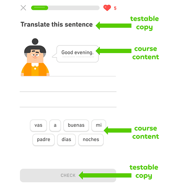
The team first identifies all the text elements that need to be translated for the 22 supported languages. This is different from the text included in the course content.
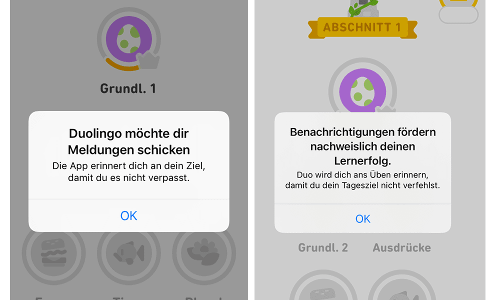
The team also leans on first-hand user research to improve its messaging for every market.
For example, their research revealed that German users were less likely to enable push notifications. Based on this insight, the team refined the pop-up message to link notifications with learning goals and consistency.
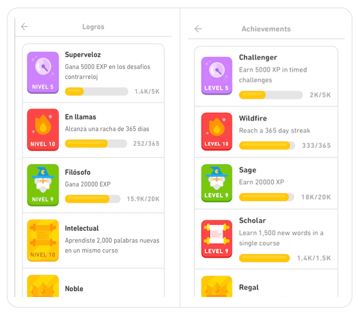
The team also focuses on inclusivity, especially for languages like Spanish with gendered pronouns.
In the achievements dashboard, the English version says “Legendary.” But the Spanish version uses the more gender-neutral word “Leyenda” instead of the masculine alternative “Legendario.”
2. Spotify: Adapted app design, copy, and animation
Spotify is another app with a global user base. The localization team works with content designers to adapt the product for every target market, primarily the non-English speaking audience.
The team works on UI localization in three core ways:
Choosing a relevant tone, style, and formatting during copy creation
Creating flexible designs to accommodate different scripts and translations
Thinking beyond the home base to see how different cultures would receive an idea
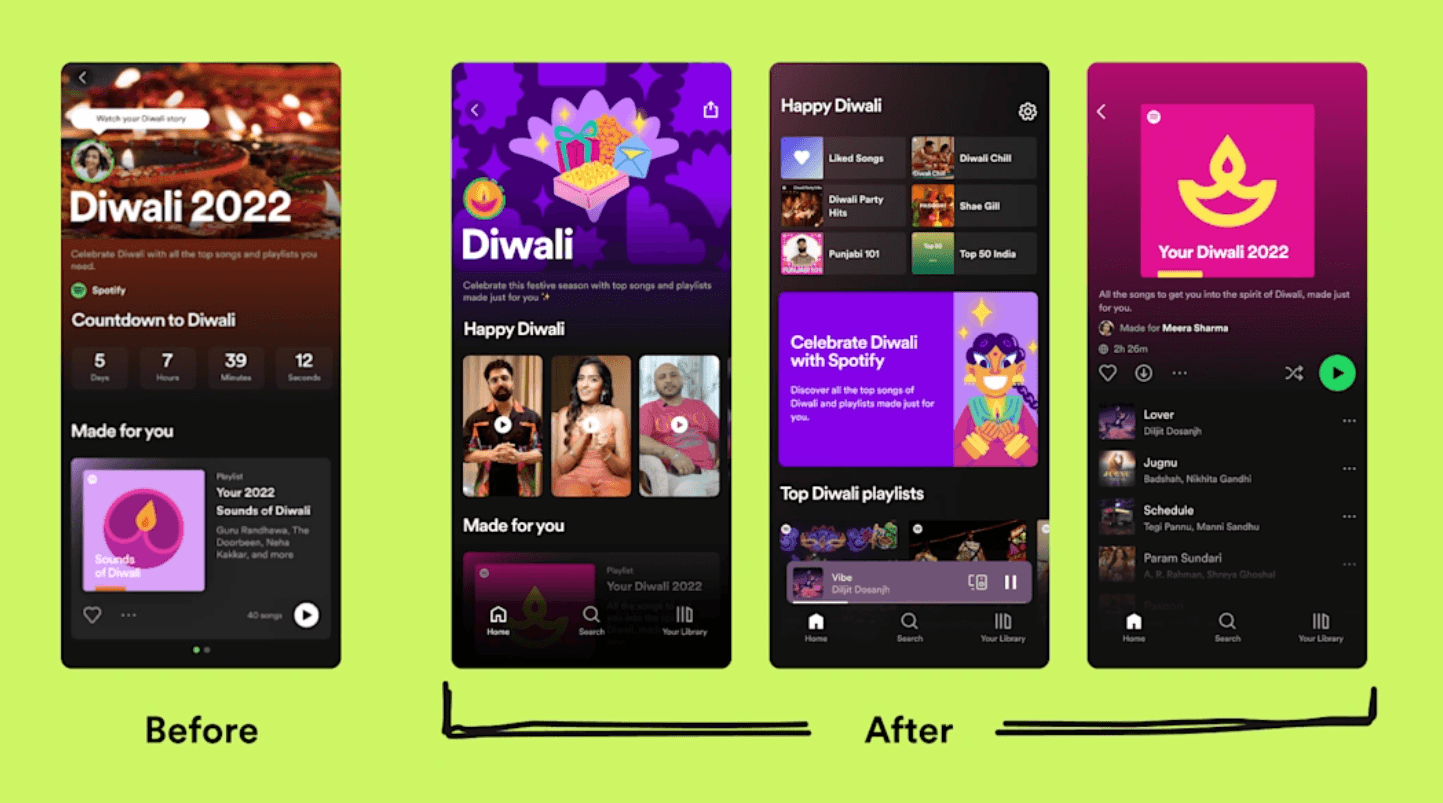
One insight was that the Indian users preferred lighter themes to celebrate the festival of Diwali. So, the team changed the interface with lighter colors and vibrant posters.
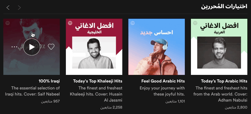
Spotify’s engineering team also pays attention to the layouts for right-to-left languages like Arabic.
Besides using a mirroring layout and Arabic font, the team flipped every directional animation like this carousel of playlists.
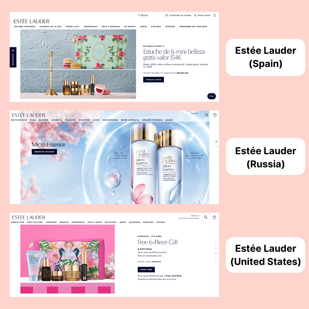
3. Estee Lauder: Modified site’s visual theme and UI elements
Estee Lauder is a global beauty brand with a presence in over 150 countries. The brand caters to buyers in every region with a localized shopping experience.
For starters, the website shows completely different visuals for every country. These visuals differ on the basis of local preferences, spotlighting the products and offers that strike a chord with the buyers.
You’ll also notice differences in other UI elements throughout the website.
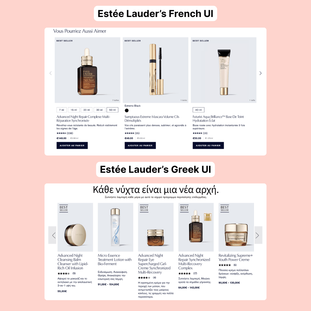
Here are two localized versions of Estée Lauder’s site targeting French and Greek users. They promote entirely different products as best sellers. The copy also varies in both versions, with variations in price points as well.
Make life easy for your users with UI localization
Localizing your site or app’s interface creates familiarity. And familiarity makes it easy to use your product, find value, and make a purchase.
While that’s an oversimplified equation, you should know that localizing your UI can produce long-term benefits, increased revenue being one of them. So, start strategizing your localization efforts with the best practices we’ve outlined in this guide.
And when you’re ready to implement, use Lokalise to streamline all the moving parts of your process. Try it for free (without a credit card) to learn how.
Shreelekha has spent the last 7 years helping B2B brands tell their stories through product-led content. Her ability to perform deep, journalistic research and build engaging narratives around complex topics is one of her strongest suits.
Thanks to her collaboration with eCommerce-focused brands, she's written extensively about international growth and gained firsthand experience in localized marketing. As she researched markets across Europe, the Americas, and Asia, she developed an instinct for cultural nuances that shape how different audiences engage with content. This sparked a deeper curiosity about how people navigate the virtual world. Through her contributions to the Lokalise blog, she's pursuing this curiosity.
Shreelekha is also skilled at creating product-led content. Her work with brands like WordPress, Backlinko, Softr, and Riverside continues to hone her skills as a writer, researcher, and marketer.
A big football and F1 fan, Shreelekha is currently learning Spanish and Japanese to feel more connected to her favorite sports and athletes.
AI translation quality achieves human parity: Is this the end of language barriers?
To paraphrase Captain Kirk, AI has boldly gone where no machine has gone before: it has finally reached human-level translation quality. But this doesn’t mean we’re done with AI translation. Far from it. We’re only just getting started, and the possibilities are both endless and exciting. After decades of clunky, error-prone, and literal-sounding machine translation, we’ve reached a pivotal moment where automated translation matches human quality. When fed t
Season 1, Episode 1: A product leader’s guide to going beyond the AI hype to find what actually works
In this episode of AI Navigators, we sit down with Adam Soltys, Senior Product Lead for the AI Translations Domain at Lokalise, to explore what’s actually driving AI success in enterprise applications today. With every company claiming to be ‘AI-powered’, how do you cut through the noise? Adam reveals what’s actually working: while everyone’s talking about AI agents, the real impact is coming from an ‘old school’ technology that’s quietly delivering extraordinary result
Transcreation vs localization: Which approach is right for you
When Coca-Cola launched its famous “Share a Coke” campaign in China, it tanked. Since most Chinese consumers don’t go by just one name, the idea of printing common first names on bottles didn’t work well. So, the brand adapted this campaign to print social labels like “Comedian” and “Fashionista.”